
THE MARKET DYNAMIC
Because of its storied history and studio location, right in the heart of Hollywood, Sunset Gower Studios (formerly Columbia Pictures) had a strong brand awareness among film industry professionals. Over years of neglect by the former owners, the once glorious image of the studio became tarnished because the facility became shop worn, tired, unkempt with studio services on a spiral downturn.
THE CHALLENGE
The main focus of the new owners was to give the studio facility a major facelift. An aggressive branding initiative had to be developed quickly in order to buy time to finish the complete refurbishing of the interior and exterior of all the buildings and grounds on the lot. Producers, the studio’s core audience, had to be sold on the fact that there was a “real” renaissance” taking place at the facility.
THE STRATEGY
The design strategy was to leverage the historical equity of the brand by giving it a fresh new suit of clothes, both physically and promotionally. It was decided that the origin of this effort should be tied to the 1930’s which represented the golden era of both the studio and Hollywood.
THE RESULTS
Anchoring the “re-branding” effort was the design of a new Brand Identity System, which included an art déco tower graphic and logotype supported by the positioning line “Building On The Legacy”. The brand now looked fresh, dynamic, progressive and innovative and moved from an “out-of-mind” status to a “go to” status in the minds of both producers and stakeholders alike.
BRAND LOGO
An authentic art deco motif was created for the look “n feel of the logo. The new icon design was intended to represent an architectural appointment you might see in the lobby or auditorium of a typical motion picture theater from the 30’s genre. The same selection process was used in choosing the type font for the logotype so that graphic and type worked together to cohesively recreate an era.

CORPORATE STATIONERY
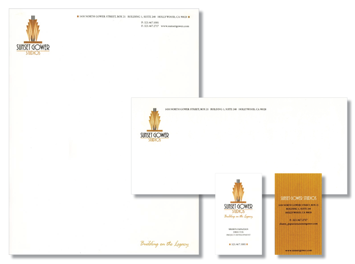
An unusual layout system was chosen for the brand application to the studio stationery. Where possible the logo was used in isolation for dramatic impact and a two sided business card enabled us to present a lot of information without cluttering the card front.
CORPORATE MARK GUIDELINES
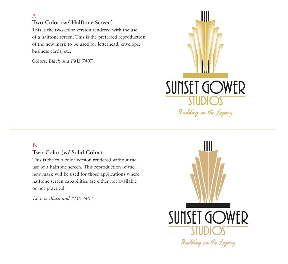
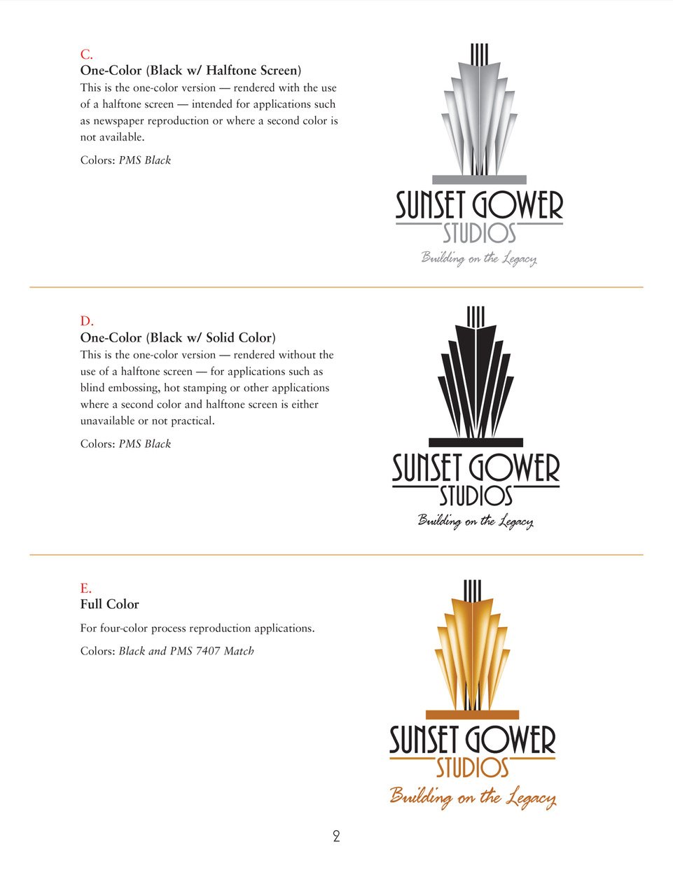
Following are the reproduction color & format guidelines for the new Sunset Gower Studios Corporate Mark.
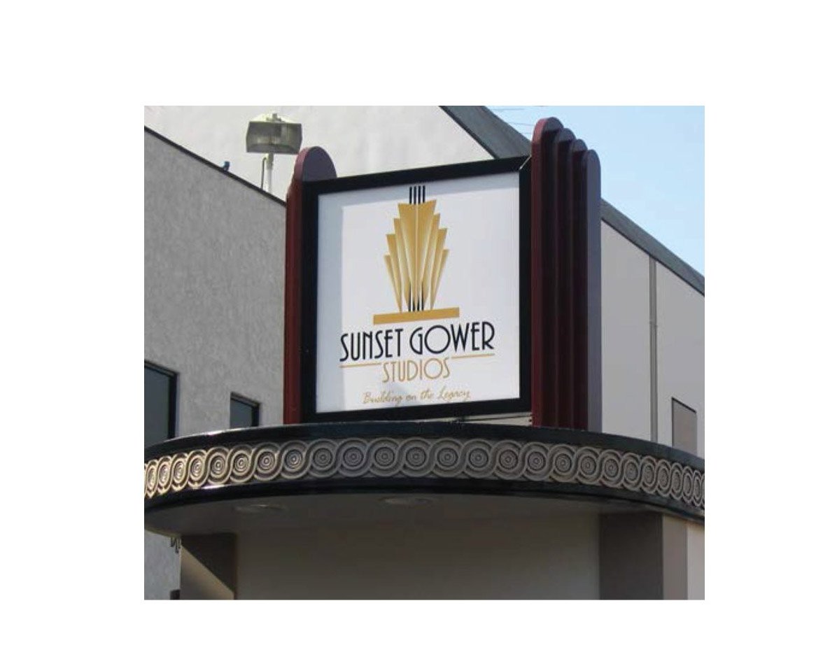
Entrance Signage
Marketing Support Tools

FIRST HOLIDAY CARD
In celebration of the first year’s successful renovations, a simple but elegant use of the brand identity graphic icon was wrapped with a beautiful red holiday ribbon. This colorful card was printed on high gloss cover and was sent out to present tenants, potential tenants, employees and other stakeholders.
